Gorgeous Green Paint Colors for Interiors
Green is having its turn in the spotlight right now and I’m all for it. Green truly is a refreshing new perspective, a breath of fresh air in your home, and can be the answer to boring bland walls. I especially love a crisp green color on cabinetry and bookshelves. Green is such a great shade of paint for bringing in color that still feels a bit neutral. Today, we’re jumping into the world of the best green paint colors…for interiors. I think green is an excellent exterior color but for today, we’re focused on interiors! In this post, you’ll discover a spectrum that ranges from soft, subtle hues to rich and moody shades. I think all of these colors are currently trending in interior design for their ability to infuse any space with vibrancy while still maintaining the perfect balance of neutrality. No matter which shade of green you are looking for this curated list of 15 of the best green paint colors will provide you with some inspiration that you may want to add to your walls. Let’s dive in and find out why green is on trend!

The Best Green Paint Colors
Be sure to grab a paint sample of any paint color you plan to try. Paint colors on the paint card and on the computer can be completely different than what you’ll see on your own walls. If you find a color you like, be sure to search around and find photos of that color in multiple spaces so you can get a good feel of how it might look on your walls then, always sample the paint color before committing to it!
- The Best Green Paint Colors
- Benjamin Moore Hunter Green
- Benjamin Moore Moonshine
- Farrow and Ball Green Smoke No. 47
- Sherwin Williams Evergreen Fog
- Sherwin Williams Pewter Green
- Benjamin Moore North Shore Green
- Sherwin Williams Sea Salt
- Benjamin Moore Raindance
- Sherwin Williams Oyster Bay
- Sherwin Williams Rainwashed
- Farrow and Ball Pigeon No. 25
- Benjamin Moore Rainy Afternoon
- Benjamin Moore Antique Jade
- Benjamin Moore Knoxville Gray
- Benjamin Moore Enchanted Forest
- Final Thoughts on Finding the Perfect Green Paint Color
Benjamin Moore Hunter Green

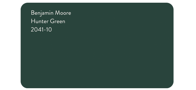
Benjamin Moore describes Hunter Green as, “a timeless dark green full of depth and elegance.” It’s a best-selling color for the brand because of its ability to make a statement. Benjamin Moore Hunter Green is a rich, deep green that’s a little muddy with its undertones. It has an LRV (Light Reflectance Value) of 6.39 meaning it’s a very dark color that absorbs a lot of light. In dark spaces, it will feel even moodier. In spaces with a lot of natural light, it doesn’t feel super bright but it’s definitely vibrant. It’s a great option as an accent wall or all over a room, especially when paired with white trim and natural wood accents. Bright white trim is a beautiful complementary color to this rich green.

Hunter Green is also a beautiful, bold choice for kitchen cabinets like this kitchen here. Paired with a neutral backsplash like marble or white subway tile the color really pops. You could also lean into the bold design with eye-catching details.
Benjamin Moore Moonshine

This muted gray-green can look like a really soft blue-green paint color with a hint of gray. Benjamin Moore Moonshine has an LRV of 66.53. It’s a light green but it has plenty of color to it making it a great option for those serene spaces that crave softness and warm. On the walls, it’s a really pale green.

If you have a lot of natural light Moonshine may appear almost off-white with green undertones more than an actual green. It’s a nice alternative to plain white walls and contrasts nicely with other neutral paint colors.
Farrow and Ball Green Smoke No. 47

Farrow & Ball’s Green Smoke is described as, “a smoky green blue.” I do feel like on the walls it is much more blue than what appears on the paint card above. It really is a muddy green-blue that is great for kitchen cabinets as well as wall colors for spaces that need a pop of color. It has a serene feel that is inviting and calming.

I love Green Smoke painted cabinets. It’s such a fun update to a space that typically feels neutral and sometimes sterile. Adding this pop of green-blue paint gives the space more personality. It also pairs beautifully with brass fixtures which gives the whole space a more luxe feel.
Sherwin Williams Evergreen Fog

Sherwin Williams Evergreen Fog is in Sherwin Williams’ Top Interior Colors Collection. In fact, it was Sherwin Williams’ 2022 Color of the Year. This gorgeous sage green paint color has an LRV of 30 which makes it a mid to dark green. It’s a versatile and calming green-gray that looks stunning in classic, traditional, and transitional spaces. It can be used in a variety of spaces, from living rooms to kitchen cabinetry to foyers. If you’re looking for an elevated green paint color that will give your space a moody feel while still appearing classic, Evergreen Fog is a perfect choice.

This versatile color is fresh and welcoming. As you can see, it pairs beautifully with warm tones like mustard, gold, oranges, and reds. It is also complemented by natural elements like woven baskets, branches, and greenery.
Sherwin Williams Pewter Green

Sherwin Williams’ Pewter Green can be described as a deep and muted dark green paint color. I’ll call it a deep sage green paint color. At first look, it might look like a rich gray but upon closer review, Pewter Green is a rich green with gray undertones. It’s favored by designers for its ability to make a statement while maintaining its neutral edge. It has an LRV of 12 which makes it pretty dark and moody. I especially love Pewter Green on kitchen cabinets, in moody bedrooms, and on any wall for a dramatic flair.

Sherwin Williams describes Pewter Green as, “dark yet calming, this cool green complements natural elements like wood and metal.” Taking a look at this deep, muddy green paint color you can see how it pairs beautifully with earthy tones and natural elements.
Benjamin Moore North Shore Green

Another beautiful pale green paint color, Benjamin Moore North Shore Green is really a blue green paint color and has some similar vibes to the very popular Sherwin Williams Sea Salt (we’ll get to that one next). It’s part of the Benjamin Moore Classics Collection and Benjamin Moore describes this color as, “a tranquil pale hue invigorated with hints of green, gray, and blue.” I love it paired with bright white because the color really pops against white walls and trim. It’s a fairly light paint color with a high LRV of 70.62.

Orlando Soria used North Shore Green in this dining space and it’s absolutely lovely.
Sherwin Williams Sea Salt

I have gabbed extensively about Sea Salt because we used it in our guest bathroom in our Florida house. I love the light blue-green shade and how it can transform from blue to green depending on lighting. It’s a really versatile paint color and I love it. It’s a slightly darker shade than North Shore Green with an LRV of 63. It also pairs beautifully with bright white trim as well as other coastal colors. It’s hugely popular and is considered an Expert Pick by Sherwin Williams.
Bathrooms are a popular space you’ll see the paint color Sea Salt by Sherwin Williams. It really sets the tone for a relaxing coastal vibe. In our guest bathroom, the color looks a little more green-gray than blue-gray. It’s such a soothing color that contrasts nicely with bright white.
Benjamin Moore Raindance

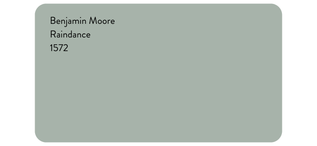
When we look at all the shades of green paint and find the middle, we might see Benjamin Moore’s Raindance there. Made for spaces looking for a calm and relaxed vibe, Benjamin Moore Raindance is the perfect mix of blue and green. It’s a mid-tone color that has an LRV of 43.47. It’s a fantastic color for dining rooms, bathrooms, bedrooms, and foyers, and is a beautiful contrasting front door color. It’s part of Benjamin Moore’s Classics Collection because of its timeless nature.
This image from Benjamin Moore shows the shade’s gorgeous medium tone and flawless color.
Sherwin Williams Oyster Bay

Sherwin Williams Oyster Bay is a soothing choice for bedrooms and bathrooms. It’s has a spa-like feel with it’s crisp coolness. With a similar LRV to Raindance at 44, it is neither light nor dark. It’s the perfect medium shade that will bring a feel of calm to any space.

You can see how serene this bedroom is with Oyster Bay as the backdrop. I love the mix of the crisp cool walls with the warm neutral furnishings. This is an excellent paint color choice if you have a coastal-inspired home or are just going for a calm and serene space.
Sherwin Williams Rainwashed

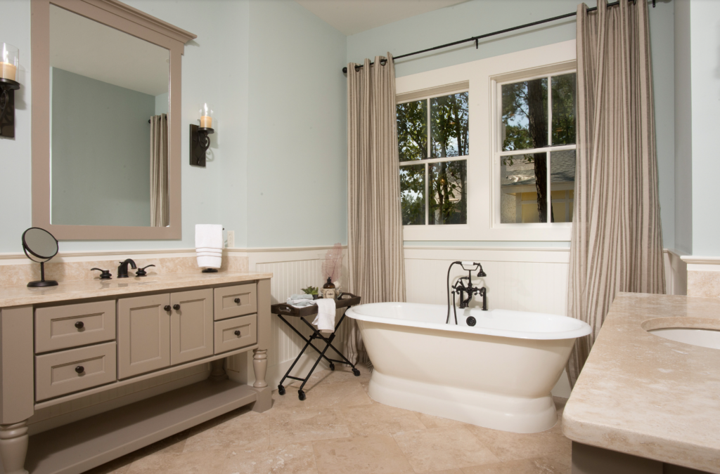
Rainwashed is a blue-green blend that can appear more blue than green. If you want a color that is true green then Rainwashed is not for you. If you want a nice blue green tone that brings a coastal flair then you should consider Rainwashed for sure. In a beach house, it’s a perfect living room, bedroom, or all-over color. It’s also a great color for bedrooms, bathrooms, and laundry rooms in homes that aren’t necessarily beach houses but have a soothing vibe. It pairs nicely with warm grays and greige colors as well as warm whites.

You can see how peaceful and smooth this color looks in a bathroom. It’s such a calming backdrop that pairs beautifully with the taupe-colored vanity.
Farrow and Ball Pigeon No. 25

A super popular green paint color from Farrow and Ball, Pigeon is a cozy green-gray that is perfectly suited for darker spaces, small spaces like mudrooms and bathrooms, and any type of cabinetry like kitchen cabinets and kitchen islands.

I think this space is a great example of why you should always test your paint colors. The abundance of natural light here has Pigeon appearing much more green and muted than on the paint card. I love this version of Pigeon so much but if I never saw this, I’m not sure I’d lean towards that color based on the paint card above.
Green is a trending color for kitchens because of its natural tones. Pigeon especially feels like a nice neutral green-gray that is warm and inviting.
Benjamin Moore Rainy Afternoon

Another moody paint color that will elevate your space is Benjamin Moore’s Rainy Afternoon. It is a part of Benjamin Moore’s Classics Collection that Benjamin Moore describes as “serene as a drizzly Sunday, this deep green is grounded by hints of gray.” The gray undertones soften the color slightly so that the color feels deep but not overwhelming. There’s a muted tone to Rainy Afternoon that evokes a sense of calm. Rainy Afternoon has an LRV of 15.20.
If you want to make a statement with Rainy Afternoon, consider painting the walls, trim, and door the same color as you see here. The color is smooth and rich and works well in a traditional or modern space. It’s a classic color that will enhance any room.
Benjamin Moore Antique Jade

An incredibly soothing paint color, Benjamin Moore Antique Jade has an LRV 53.75. It’s a medium tone gentle green hue that “brings a sense of relief and calm to a space.” It’s part of Benjamin Moore’s Classics Collection. It’s a great paint color if you want a color that provides a soothing backdrop.
Antique Jade has a peaceful quality that is so appealing in interiors. You’ll often see it used in bathrooms and bathrooms. I think it works well in coastal-inspired spaces as an alternative to the typical blue and white that you see. Paired with white trim the green paint pops beautifully.
Benjamin Moore Knoxville Gray

Probably my favorite paint color in this collection, Benjamin Moore Knoxville Gray is intense and full of warmth. It’s a rich deep color with an LRV of 15.68. Knoxville Gray is ideal for interiors that desire a luxe feel. It can work beautifully as an accent wall but I love it as a whole room paint color (walls, ceiling, trim) because it has such a high impact.

In this stunningly luxurious living room, the Knoxville Gray is the statement as it covers the walls, trim, and ceiling. Going all in on a paint color can really pay off with stunning results.
Benjamin Moore Enchanted Forest

I have to also give an honorable mention to Benjamin Moore’s Enchanted Forest. A moody and elegant green paint color that will definitely make a statement is Benjamin Moore’s Enchanted Forest. With an LRV of 15.96, it’s a deep, dark green. It has some gray undertones which gives it a more muted. It’s part of Benjamin Moore’s Classics Collection and is a gorgeous rich green paint color that is a great option for accent walls, built-in shelving, or cabinetry.

Final Thoughts on Finding the Perfect Green Paint Color
Green is a super versatile paint color that has earned its popularity in recent years. I think its ability to have a neutral feel contributes to its usability. From soft, pale greens to deep, rich hunter green, there’s a shade for every style and space. With the right green paint color, you can add vibrance and richness while still maintaining your own style. Consider trying out some of these gorgeous green paint colors to elevate your interiors and bring a touch of serenity (or moodiness if you wish) into your home.


