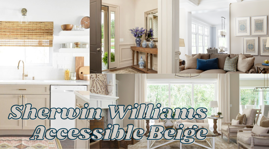
Sherwin Williams Accessible Beige SW 7036
Warm beige with gray undertones gives us one of the most popular greige paint colors, Accessible Beige by Sherwin Williams. Greige has been and remains a popular neutral paint color for home interiors. I think we’ll continue to see greige as a trending paint color for some time to come. Because of that, I thought it would be a good idea to explore Sherwin Williams Accessible Beige, a go-to greige among interior designers and homeowners alike. Greige paint colors are great for a neutral whole-house color palette. They go well with other neutrals like warm whites, and some grays, and you’ll even see greige colors in color palettes that include blue-grays or other coastal colors.
- Sherwin Williams Accessible Beige SW 7036
- How Light or Dark is Accessible Beige
- What's the LRV of SW Accessible Beige?
- Is Accessible Beige Considered a Warm Paint Color and What About Those Undertones?
- Light Exposure and Accessible Beige
- Accessible Gray in Real Spaces
- What Colors Go with Accessible Beige?
- Where Should I Use Sherwin Williams Accessible Beige?
- What Colors are Similar to Accessible Beige?
Sherwin Williams Accessible Beige SW 7036
Accessible Beige is a warm beige with gray undertones. Its neutrality and warmth make it a great all-over paint color. Sherwin Williams includes Accessible Beige SW 7036 in their Top 50 Collection of paint colors and describes it, “Unlike many beiges, this color has undertones of gray that can give your space a warm, snug feel. Pair with earthy tones.”
Beige is not just on trend right now, it is all the way back. From the warm sandy tones to the softer cream tones, beige paint colors are rivaling the cooler gray tones for space among the top neutral paint colors. One of the top beige colors is SW Accessible Beige and there’s no wonder why. It’s the perfect mix of warmth and softness. It’s a stunning paint color that can work in different rooms. It’s neutral enough that you can use it in a variety of spaces including in kitchens and on kitchen cabinets. If neutral is your jam but you are tired of plain white walls then you might like the transition to Accessible Beige.
How Light or Dark is Accessible Beige
Let’s explore the value of Accessible Beige, which is how light or dark a color is. Accessible Beige is a relatively light paint color although it does have a lower LRV. In comparison with other cream/beige paint colors, it has a bit more depth. Overall, I think Accessible Beige can be considered a light paint color. Keep in mind that this paint color will appear softer with exposure of natural light.
What’s the LRV of SW Accessible Beige?
The Light Reflectance Value or LRV of Accessible Beige is 58.
LRV is a useful tool for determining how light or dark a paint color is (100 being the whitest white and 0 being the darkest black). Keep in mind that “light” refers to Light Reflective Value, meaning the amount of light reflected. The more reflective the color, the brighter it will appear. With “light paint colors” you expect their LRVs to be on the higher end. Accessible Beige is above 50 but for LRV this isn’t really a typical number for a light paint color. Overall, it’s a nice warm beige that will appear lighter with much light. In comparison to another popular beige paint color, Sherwin Williams Balanced Beige which has an LRV of 46, Accessible Beige is significantly lighter and appears so on walls.
Is Accessible Beige Considered a Warm Paint Color and What About Those Undertones?
Yes, Accessible Beige is decisively warm. Here’s the tricky thing about Accessible Beige: it’s got beige in the name but this color is definitely a cross between gray and beige AND it’s warm. It’s got some gray undertones but it’s got some yellow in there too that contributes to the warmth. Typically beige colors have some pink or yellow tones that can be evident on the wall. Because it’s cut with some gray undertones, Accessible Beige doesn’t have a tendency to flash yellow or gold which makes it a really nice, warm gray/beige paint color. In my opinion, you get the best of both worlds.
If warm beige/greige is not for you, maybe consider Repose Gray which is a beautiful warm gray that just barely falls on the gray side of greige.
This is where I tell you how important it is to sample any paint color before you commit to painting your walls. It’s a great idea to stick paint samples of your desired color in the space you’re thinking about painting and check in at varying times throughout the day to get a true, accurate idea of what the color will look like in your space.
I really like SAMPLIZE. Samplize offers convenient peel-and-stick paint samples that are affordable, more accessible, and better for the environment than traditional paint pots. The swatches are mess-free, display colors just like a wall, are reusable so you can try them out all over the room, and arrive on your doorstep in just a few days!
For your convenience, this post may contain affiliate links. That means, at no additional cost to you, I may make a small commission on your purchase. Click here to read my full disclosure policy.
Light Exposure and Accessible Beige
It makes sense that colors appear differently in different lighting situations. When exposed to an abundance of natural light, Accessible Beige has a soft, warm feel. It’s cozy but not overwhelmingly so. In a space with zero natural light, Accessible Beige gains depth, feeling deeper and slightly heavier.
In South-facing rooms, you’ll see Accessible Beige staying pretty true to its neutral core. It will be on the softer side with a slight bit of gray. In North-facing rooms, Accessible Beige will still feel soft and inviting, just slightly grayer.
Whether your space has a lot of windows or not much natural light, Accessible Beige has the opportunity to do well. It’s a great warm beige color that will appear slightly softer/grayer with more light and warmer and more golden with less natural light.
Accessible Gray in Real Spaces
This earthy hue can create a cozy atmosphere in any room and pair nicely with other neutrals. It also works great for creating an inviting kitchen or living space, making it the perfect choice for many spaces. Let’s take a look at Accessible Gray in real spaces!
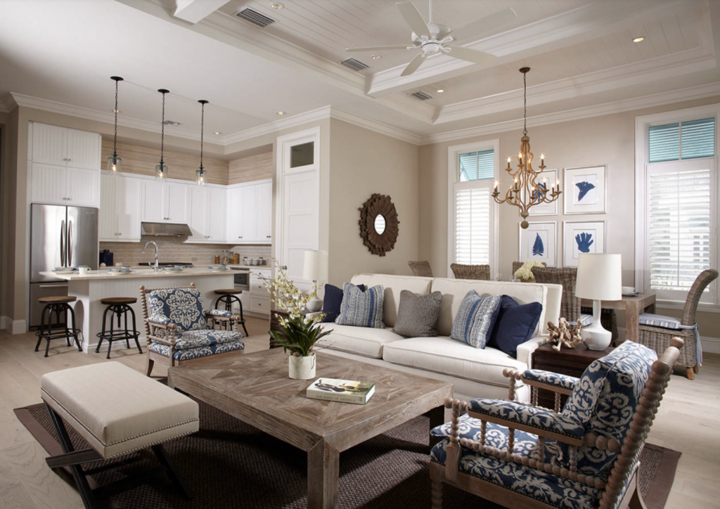
The first thing you notice about Accessible Beige in the space above is how beautifully it pops against the white trim. You may not consider white to be a contrast to Accessible Beige but you can really see the depth of this color when paired with white trim.

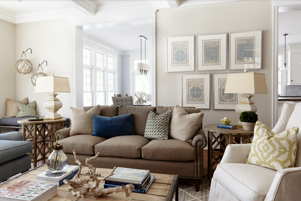
I love this example of Accessible Beige but what it really important to notice is that the same color is used on the wall and trim, both Accessible Beige. The wall is painted in a matte finish while the trim is painted in semi-gloss. Simply using different sheens can provide a beautiful yet subtle contrast.

By now it’s clear that Accessible Beige and white trim is a match made for sophistication.


Whoever coined the term boring beige has never seen beige like this. Accessible Beige is the perfect backdrop for this gorgeous space.


Finally, feast your eyes on this silky smooth taupe/beige finish on these kitchen cabinets. Highly recommend trying Accessible Beige on cabinetry because it’s just too good! I really like it as an alternative to the typical gray and white painted cabinets that we are used to seeing.
What Colors Go with Accessible Beige?
I like Accessible Beige with cool colors, other neutrals, and maybe some warm earthy tones. I think Accessible Beige goes great in a coastal color palette with blues, greens, and white/creams but you can also marry Accessible Beige with a warm, darker tan for a beautiful contrast. You can just go a couple shades up on the same paint card to SW Moth Wing or another rich tan like Sanderling if you want a deeper beige/tan to go with AB. I also like SW Sea Salt, SW Stardew, and SW Greek Villa as complimentary paint colors for Accessible Beige.
Where Should I Use Sherwin Williams Accessible Beige?
AB is a fantastic paint color for all the interiors. Neutral colors are popular and this one is a good one. It’s a great color to use throughout the walls in your home or for just one or two spaces. I especially love Accessible Beige for cabinetry like kitchen cabinets, laundry room cabinets, or bathroom vanities. Additionally, AB is a great paint color for exteriors. It’s nice and neutral but it is not so light that it will wash out too much. All paint colors wash out in full natural light so having a color with some depth, like AB is a good choice for an exterior paint color. Consider SW Accessible Beige with Chantilly Lace trim. If you are considering this paint color for your home, here are some ideas for spaces that I think will look great in Accessibe Beige.
- Any accent wall
- Bedrooms
- Living Room
- Dining Room
- Bathroom
- Entryway
- Hallways and Stairways
- Kitchen
- Kitchen Cabinets
- Trim Color
- Exteriors
What Colors are Similar to Accessible Beige?
Is there a Benjamin Moore Equivalent to Accessible Beige?
The answer is yes, kind of. Let me show you Benjamin Moore Edgecomb Gray
Sherwin Williams Accessible Beige vs. Benjamin Moore Edgecomb Gray

There is not an exact match on the Benjamin Moore side to Sherwin Williams Accessible Beige but if I had to pick a color that was close I’d say, Edgecomb Gray. Edgecomb Gray is a soft neutral greige paint color that is comparable to Accessible Beige in warmth. It’s a touch lighter with an LRV of 63 compared to Accessible Beige’s 58. Accessible Beige has more brown/beige than Edgecomb Gray. If you want something just a slightly bit cooler and lighter, then Edgecomb Gray is a great option to consider.
Sherwin Williams Accessible Beige vs. Sherwin Williams Natural Tan

Let’s take a look at two similar colors from Sherwin Williams. Sure one is a “beige” and another is a “tan” but they are pretty close in color. Now is a good time to tell you that you should never infer a color by the name of the paint color. That being said, beige and tan are basically the same for all intents and home design purposes. Accessible Beige is slightly muddier with more depth. Natural Tan is several points lighter with an LRV of 65. If you love Accessible Beige but wish it were lighter, you’re going to love Natural Tan.
Sherwin Williams Accessible Beige vs. Behr Gravelstone
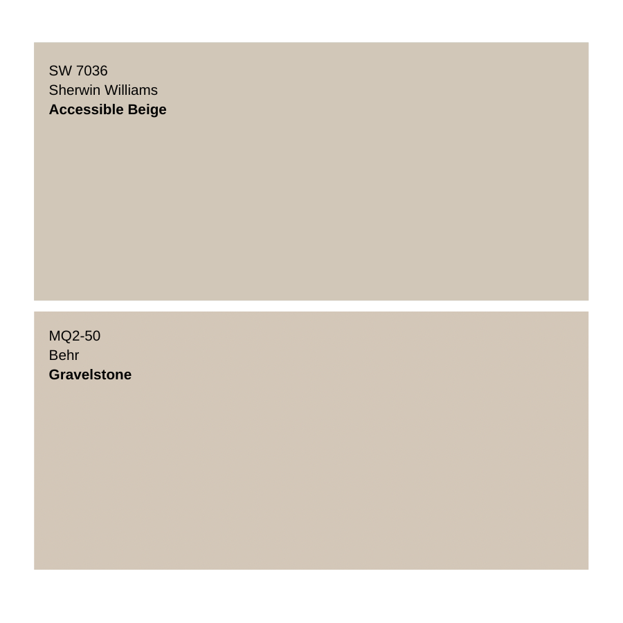
Behr Gravelstone isn’t nearly as popular as Sherwin Williams Accessible Beige but it’s adjacent and I wanted to compare it here. I love Gravelstone and actually used it in my bedroom here. I particularly love this color because it’s part of the Behr Marquee Collection which has amazing paint coverage. Comparably, the LRV is the same so they’ll enjoy the same amount of depth. I find Gravelstone to be slightly browner while Accessible Beige is slightly more yellow. Neither of them shows those undertones obviously.


What color is the front door in the picture? My walls are accessible beige and looking for a color for my front door.
Thanks!
What color is the door in the entry picture?