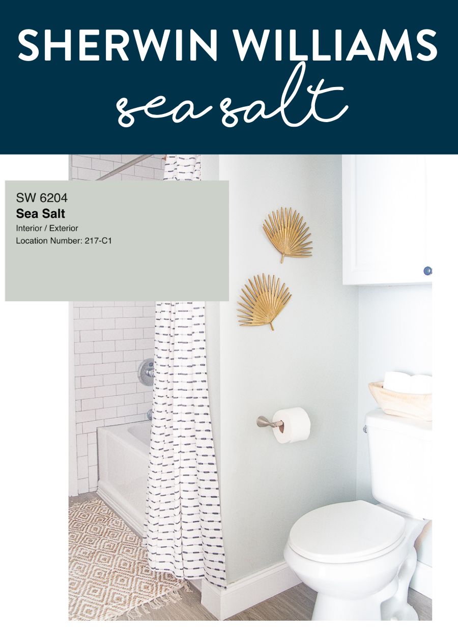
Sherwin Williams Sea Salt – A Perfect Blue Green Paint Color
Sherwin Williams Sea Salt SW 6204 is one of the best-selling paint colors for beach houses and it’s really easy to figure out why. It’s a gorgeous, soothing, light color that can almost be considered neutral. It’s a perfect paint color for a bathroom or bedroom and even a whole house color in the right coastal decorated home. It’s a great color for a light and bright home. You likely wouldn’t use it in a space where you want to be moodier but it does have some versatility. Sea Salt is a color that has a pretty cult following, you’ll find that those who love it can’t stop using it. It’s that good! One thing I personally love about this color is that it looks great in well-lit spaces as well as spaces with no natural light at all. I think that’s the true mark of a great universal paint color. Let’s dive into what a chameleon Sea Salt can be.

Sherwin Williams Sea Salt Paint Color
I call Sea Salt a chameleon because it can really vary under different light conditions which you’ll see below but as an overview, Sea Salt changes from green/gray to blue with changes in lighting. In a space with no or almost no natural light the color reads more green-gray – you’ll see that in our bathroom below. In a more mixed lighting situation such as windows just on one side of the room, the space looks a little bluer but still has a fair amount of green in it – this is my favorite type of space to see Sea Salt in. Lastly, in a space that is full of natural light, the color reads much more blue and much lighter.
Sea Salt in a Bathroom
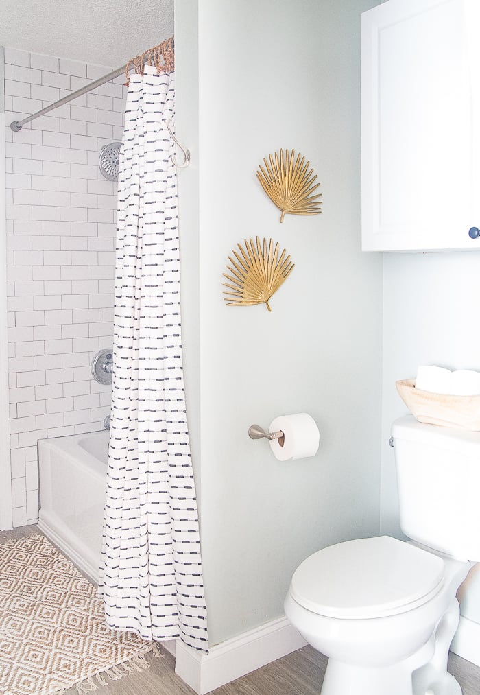
Bathrooms are a popular space you’ll see the paint color Sea Salt by Sherwin Williams. We used it in our own guest bathroom and love it in that space. This paint color sets the tone for the relaxing coastal vibe that I was hoping for. Our guest bathroom is in the middle of our house and has absolutely zero natural light. The lack of natural light makes picking paint colors a challenge but I knew I wanted to try Sea Salt in this room. This color can pull more blue-gray or more green-gray depending on the lighting situation. You can see in my bathroom Sea Salt looks a little more green-gray than blue-gray. It’s such a soothing color that contrasts nicely with the classic, white board and batten.
See all of the coastal-inspired paint colors I’ve used in my home.
Sea Salt in a Light and Bright Bedroom

Another great place to try out Sherwin Williams Sea Salt is in a bedroom. Another space that calls for a calm and soothing color and Sea Salt delivers. With a bit more natural light like in this space, you can see that the color is a bit bluer than in my bathroom. This is probably my favorite version of this paint color. This space has some natural light but it’s not exactly a room full of windows which provides the perfect lighting conditions for a soft and soothing version of Sea Salt.
Sea Salt in a Kitchen
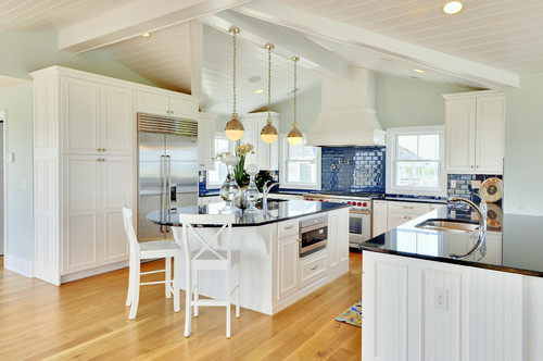
I love this color in larger spaces as well like a great room, living room, kitchen, or entryway. It is the perfect color for a coastal home. It’s also great for a farmhouse-style home or even one with a more transitional style. Again, it is a chameleon color in that it can look a bit more muted in spaces with less natural light and be very light and bright in those spaces with natural light that just pours in. You can see that in the photos above – Sea Salt pulls bluer and gives a very light and bright feel to the space.
Sea Salt on an Exterior Door
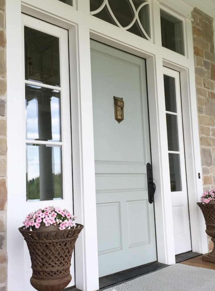
What about Sherwin Williams Sea Salt on a front door? While I love the classic look of a black front door, putting a splash of color like Sea Salt on a front door is an inviting and gorgeous choice. Sea Salt would be a great option for the front door of a coastal-inspired home, a beach house, or even a farmhouse.
What I love most about Sherwin Williams Sea Salt is that it’s versatile which also happens to be the toughest thing about picking this color. It can look both muted and more green/gray in lighting conditions that lack an abundance of natural light. Then, in light and bright spaces with lots of natural light, it reads much lighter and much bluer. In fact, you could put this paint color throughout an entire house and it’s likely that guests wouldn’t know that it was the same color in the living room and the bathroom because it can be so different under different lighting conditions.
In Conclusion
There are many gorgeous blue paint colors out there and it can be tricky to settle on the right one for your space. If you have a light and bright space and are looking for a calm and soothing color then Sherwin William Sea Salt should absolutely be on your list of colors to sample. It’s a great option and it’s really no wonder why it’s such a popular choice for many.


