Picking Neutral Paint Colors – From Bold to Normal errr Neutral.
Big thanks to Behr for sponsoring this post! My positive opinion of their high quality (and time saving) paint is totally my own.

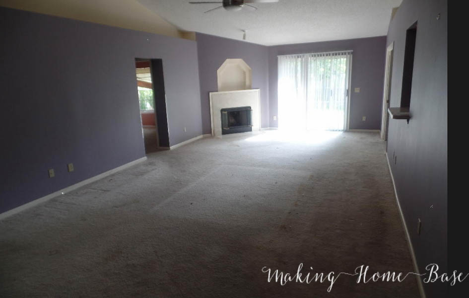
When I first laid eyes on the Florida house my first thought was, “yikes!” For real. We bought the housing knowing that we would be painting it the day we received the keys. Once the bank accepted our offer I began looking for the perfect neutral to calm this space. My daughter couldn’t understand why we would cover up the walls when they were already painted my favorite color, purple. Ha. Now, I do love purple but purple walls is a bit too bold, even for me.

Because the living room only had that slider as a source of natural light, the bold and dark wall color really made the space feel dark and cave like. Right away I craved light and bright – I needed to get to a neutral space with this house before I could even consider decor.

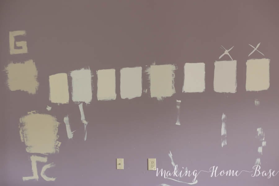
Right away, I started pulling paint samples like it was my job. We went through quite a few but these are the ones that made it to the wall o’ choices. I was really naive and thought it would be an easy decision to pick a paint color for all of the common living spaces in our house. It was not an easy task. I knew for sure I wanted to use the a shade of Behr Marquee paint because I love their formula and love the coverage. On such dark walls and such a large space having to do coat after coat of paint was out of the question (did I mention we painted just a week after I had Millie?).
I ended up choosing the third color in, Crisp Linen by Behr. Guys! The difference is stunning.

After day one of painting I was practically hugging the walls – I was so excited about the color.

By simply painting we had a lighter and brighter space that immediately felt larger.

We changed out the slider for french doors and that allows so much more light to come in. French doors plus a neutral paint color make this space so bright, you wouldn’t believe that the only source of natural light in this room comes from those doors!

We painted the living room, dining room, kitchen, and entryway Crisp Linen by Behr. It’s really the perfect neutral paint color and goes well with whites and grays. Having that perfect go to neutral is everything!

I love the contrast between it and the bright white trim.

There you have it! We painted about 1000 square feet with in the Crisp Linen color. We covered not only our purply living room but also the green kitchen and breakfast area (see kitchen before photos). When covering bold colored walls you want to make sure you have high quality paint. I was so happy with my decision to go with the Behr Marquee line of paint. We were able to cover the purple walls with one coat of paint (plus touch ups) but no primer (look ma, no primer!) and I was so grateful because let’s be real, painting an entire house is no joke.

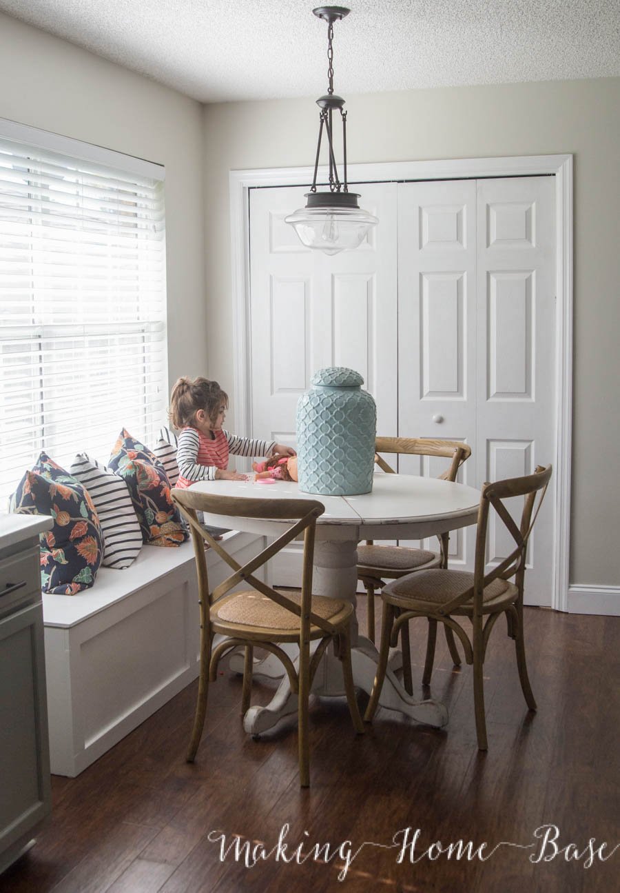
Here’s a glance of our breakfast area + a sneak peek at the window seat we just built – more on that soon. Do you have a go to neutral you love? I’d love to hear about it!


Love the new paint color! It really brightens and opens up the space! Looking forward to hearing about your other home improvement projects!
Love your color choice, and I can’t wait to see more of this breakfast nook!
That window seat!! Ahhh. Love! I also love the pillow combination you put together. I never would have thought to throw together floral and stripes. You are talented, my friend!
The right paint color makes all the difference!!
It looks tremendous! We used the marquee on our first rental Reno last winter and it did cover quite well. I was happy with doing only one coat – as long as you put it on thickly enough it was amazing. Great neutral colour choice, Chelsea!
Thanks Krista, I was really impressed with the coverage, too.
Thank you Chelsea for the pictures. I am redoing a powder room. Spent many hours looking for the right paint color. I wasn’t sure about the Crisp Linen. After seeing your pictures, my mind was made up. It appears to look exactly the way I envision my room. Can’t wait to see my finished room.
So good to hear, Sherry! I’m always happy to be a help 🙂 Happy painting!
Love it! We’re considering this color in our main living spaces. Would you mind sharing what paint color you used on the trim?
Hi Rebecca, sure it’s Ultra White by Behr 🙂
Awesome! That’s what we’re planning to use. 🙂 Thanks!
Good luck!! 🙂
What texture did you use? Eggshell, satin, gloss??
Hey there Peggi 🙂 I always do Satin for indoor walls. Hope that helps!
Where did you get your pillows? ?
Hi Chelsea,
Your room looks beautiful with the light neutral choice of Crisp Linen and the dark floors! I am in a sea of paint chips for painting a family room that gets a lot of light but has lighter wood floors. You describe Crisp Linen as a cross between a grey and a beige. Do you know of another crossover color like this in Marquee that is just a little bit darker? So far, the two colors I tested in another color brand but Behr paint were too grey for one and two beige for another. Now I have 8 chips up – way too overwhelming for me.
Thanks!
I think I finally found what I am looking for ! After so many samples I thought I was going for a gray color for all around the house but the grays weren’t working for me they had the blue undertone I didn’t like, and beiges just looked like I didn’t want to go there, but this color is Perfect I’m glad I came across it through Pinterest. Thanks for sharing. Where can I see more of your styling tips?
Unbelievably, I googled Behr Crisp Linen because I’m repainting my Florida CONDO which looks EXACTLY LIKE YOUR LAYOUT! My walls were clay not purple LOL. With burnt orange Italian tile floors, though wich complicated things. I really like it but was curious about seeing other sample rooms and there you were! Your place turned out so great I know my choice was right! So….back to painting! Thanks for your post! I agree with your assessment. It has just enough green undertone to not be all pinky or yellow-y but doesn’t really read green or even grey – which was my problem with other white shade colors in bathrooms with no windows.Everything looked either grey or dirty white (in the kitchen). I realized I had to go just slightly darker so the “dim” light would pick up the “crisp linen” and it’s perfect.