Sherwin Williams Repose Gray SW 7015
Oh boy, not another blog post on the internet about Sherwin Williams Repose Gray. Actually, yes one more. I can’t share about paint colors and leave out one of the paint brand’s top sellers. If you are on the hunt for a perfect neutral feeling, warm gray then please, read on. Repose Gray is one of the most popular gray paint colors for Sherwin Williams so I guess we should discuss what makes it so great.

About Sherwin Williams Repose Gray
Repose Gray is a warm gray with a fairly neutral base off the bat. Most warm gray paint colors can push the envelope towards greige but Repose Gray stands firmly in the neutral gray category. Its neutrality and appearance of “true gray” are what make it so popular with homeowners and designers alike. Not surprisingly, SW Repose Gray 7015 is among Sherwin Williams’ Top 50 paint colors. Sherwin Williams describes its Top 50 colors as, “a variety of neutrals which span a full spectrum of shades and hues.” Its position on this list is a nod to not only its favorability but the favorability of gray colors as a whole. Gray is still very much trending.
I keep hearing questions like, “are gray walls going out of style?” “Is gray still popular?” And the answer is clear in this article from Indiana Business Journal, “The gray wave is still here and going strong.” Going on to say that Repose Gray was the most popular paint color in their local market. In a time when colors are starting to trend more boldly, I think the discussion below will give a good sense of why Repose Gray is still so popular. You may even want to figure out a way to use Repose Gray in your own home.
How Light or How Dark is Sherwin Williams Repose Gray?
First things first – let’s talk about the value of Repose Gray, meaning how light or dark is this color? Repose Gray is a light gray that can reflect a decent amount of natural light. In a lot of natural light Repose Gray can wash out appearing even lighter while in a low light situation, Repose Gray can appear like a more medium-tone gray paint color.
What is the LRV?
The Light Reflectance Value or LRV of Sherwin Williams Repose Gray is 58.
LRV is a useful tool for determining how light or dark a paint color is (100 being the whitest white and 0 being the darkest black). Remember that “light” refers to Light Reflective Value, meaning the amount of light reflected. The more reflective the color, the brighter it will appear. This light gray has an LRV of 58. In comparison with another paint color that we’ve reviewed, Sherwin Williams Passive is another light gray that has an LRV of 60 which is in the same ballpark. Alternatively, Sherwin Williams Crushed Ice is significantly lighter with an LRV of 66.
Is Repose Gray a Warm or Cool Color?
The tricky thing about gray paint colors is that even when they appear neutral, they always have warmth or coolness in their undertones. Without a doubt, Repose Gray is a warm gray paint color. In fact, in some circles, it might even be called greige paint color, a combination between gray and beige. I won’t go that far but I will say that Repose Gray is firmly in the warm gray camp. That being said, there are some times that you may notice a chill in Repose Gray. We’ll go over why that is.
It’s important to understand that all paint colors have undertones and these undertones affect how the color will look and feel in a room. This is especially true with gray paint colors.
Some cooler grays can feel icy or cold while some warm paint colors that are too warm start spilling into the beige category.
Repose Gray is quite neutral in that it isn’t too cool or too warm.
What Undertones Does Repose Gray Have?
Relevant to color temperature are color undertones. Every gray paint color has undertones even the “true gray” paint colors. Some are subtle but some are more obvious. Sherwin Williams Repose Gray is a warm color with some surprising undertones. It’s got violet or purple undertones along with a touch of green undertones. Don’t let that knowledge immediately turn you off of this paint color. Undertones give the color its depth. Sometimes they soften a color or keep it from feeling dull. Typically the undertones do not take over the color but it’s important to be aware of them so you can counteract them if needed. These undertones are usually seen in cooler paint colors however there is some brown in Repose Gray which gives this color the warmth we already discussed.
If you are uneasy about the violet undertones it’s best to test it out and see how Repose Gray looks on a sample.
This is where I tell you how important it is to sample any paint color before you commit to painting your walls. It’s a great idea to stick paint samples of your desired color in the space you’re thinking about painting and check in at varying times throughout the day to get a true, accurate idea of what the color will look like in your space.
I really like SAMPLIZE. Samplize offers convenient peel-and-stick paint samples that are affordable, more accessible, and better for the environment than traditional paint pots. They are mess-free, display colors just like a wall, are reusable so you can try them out all over the room, and arrive on your doorstep in just a few days!
If you are buying paint pot samples, consider using large posterboard for samples to give yourself the most accurate idea of the color.
For your convenience, this post may contain affiliate links. That means, at no additional cost to you, I may make a small commission on your purchase. Click here to read my full disclosure policy.
Light Exposure and Repose Gray
Light is an essential component when it comes to paint colors. From exposure to directional light, you want to have some awareness of both.
In a dark room, Repose Gray can feel dull or muddy. In spaces that do not have great natural light, you can add good artificial lighting to bring more interest to the wall color.
In rooms with some natural light, you may see Repose Gray at its very best. It appears as a soft warm light gray.
Lastly, in space with an abundance of natural light, Repose Gray works well but may wash out in a really bright space.
Repose Gray in Real Spaces
So far if you like what you’ve heard about Repose Gray, then let’s see it in action. The photos below will give you a good idea of how different lighting can affect the appearance of Repose Gray.

In this example of Repose Gray, even with an abundance of natural light, you can see that there is a slight blue cast to the walls. It makes the color slightly cool but still, it appears quite neutral for gray. Additionally, the blue chairs contribute to the overall coolness of the space.

In another living room with an abundance of natural light, Repose Gray feels a lot warmer. Some of that is due to the warm accents like the stone fireplace and the rich brown tones. This example feels like a warm blanket. This is when Repose Gray is at it’s best.

I love Repose Gray is large open spaces. Often times these spaces can fall flat but this paint color is inviting! In combination with rich wood flooring, Repose Gray appears very true gray! If you have a nice open space with tall ceilings you may way to try Repose Gray!

Another living room with Repose Gray, this time beautifully designed by my friend, Linda! I love this space because it’s lovely and achievable. She appreciates blues as much as I do. You can see in here that Repose Gray is showing off its violet undertones but just barely. It’s enough to give it a touch of coolness but it’s still a nice neutral gray.

By now I think you’re recognizing a trend, Repose Gray can flash coolness or warmth depending on the space. Neither is so strong that it’s a turn off in my opinion. In the bedroom above, Repose Gray is toasty warm. This is a neutral that works so well for a monochrome look.

If an allover paint color is what you are looking for then you should definitely consider Repose Gray. Here you can see Repose Gray in a large hallway. Complemented nicely with rich warm wood flooring, Repose Gray is lovely choice.

This space is probably one of my favorites on the internet. I love the coastal, natural vibes and Repose Gray is an excellent backdrop for that. The gray is perfectly neutral here, it compliments the natural decor very well.

Here’s another space where Repose Gray is showing off its potential for coolness instead of warmth. Part of the reason for that is the cool blues and gray accents in the space.

As an exterior paint color, Repose Gray is washed out from sunlight but not so much that it doesn’t work. It actually works quite well. It’s just now a very light gray as opposed to the light to medium gray it gives indoors.
What are some Complementary Colors to Sherwin Williams Repose Gray?
Since SW Repose Gray is warm yet neutral, it goes well with almost anything and goes really well with other neutral colors. If it feels cool on the walls you can warm it up with warm white paint trim. You can also cool it down with blue accents or colors that have blue undertones. I like Sherwin Williams’s Dark Night as a bold and interesting complementary dark blue paint color. Alternatively, Repose Gray can work with warm colors like a muted brick red or clay color or even gold tones that have beige undertones.
Overall, many colors will go nicely with Repose Gray. I recommend a white trim and accent colors that appeal to your personal taste. My favorite white trim paint color is Benjamin Moore Chantilly Lace. It’s a beautiful soft white. If you want a bright contrasting white trim color, I would consider Extra White by Sherwin Williams or even Sherwin Williams Pure White.
Keep in mind that decor is as much a complement to wall colors as the paint itself. You can really bring a paint color to life or allow it to fall flat with your decor decisions.
Find some coastal home decor inspiration here.
Where to Use Sherwin Williams Repose Gray?
SW Repose Gray is a fantastic paint color for interiors. Its popularity is for good reason. I think of this neutral gray as a perfect “all over” paint color. As discussed above, even in low-light situations, Repose Gray works. That speaks a lot about the strength of this paint color. If you are considering this paint color for your home, here are some ideas for spaces that could easily wear Sherwin Williams Repose Gray well.
- Any accent wall
- Bedrooms
- Living Room
- Dining Room
- Bathroom
- Entryway
- Hallways and Stairways
- Kitchen
- Kitchen Cabinets
- Exteriors
What are Some Alternative Gray Colors to Repose Gray?
If you aren’t totally convinced that Repose Gray is right for you, or maybe you’re looking for a color that is a bit cooler or a bit warmer. Or maybe you just want to see what other popular grays are out there, you should read on.
Sherwin Williams Repose Gray vs Sherwin Williams Passive
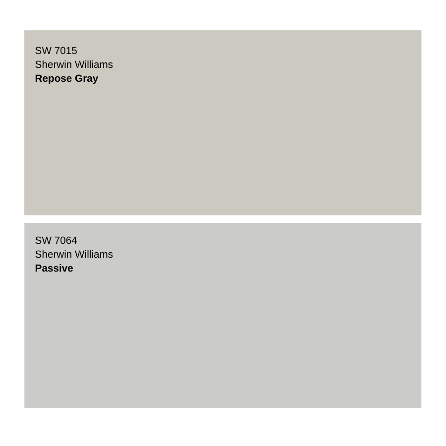
Passive is an excellent option if Repose Gray is just too warm for you. It’s also a part of the Top 50 Collection for Sherwin Williams. Next to Passive, Repose Gray looks a touch greige or as if it might have some taupe undertones. Passive is a bit lighter with an LRV of 60. Both colors are soft and refined but Passive has a coolness that Repose Gray lacks. Be careful with Passive in a north-facing room as it can cast a bluer light making Passive go icy.
Sherwin Williams Repose Gray vs Sherwin Williams Agreeable Gray

Talk about two heavy hitters, these two are probably the most popular gray paint colors in Sherwin Williams’ collection. If a hint of more warmth is what you are craving then you must look at Agreeable Gray. Like Repose Gray, it’s in the Top 50 Paint Colors Collection. It has an LRV of 60. Comparatively, you can see that Agreeable Gray’s warmth just barely touches the greige category. If Repose Gray is too cool for you but you want to try another old reliable, Agreeable Gray is worth sampling.
Sherwin Williams Repose Gray vs Benjamin Moore Revere Pewter
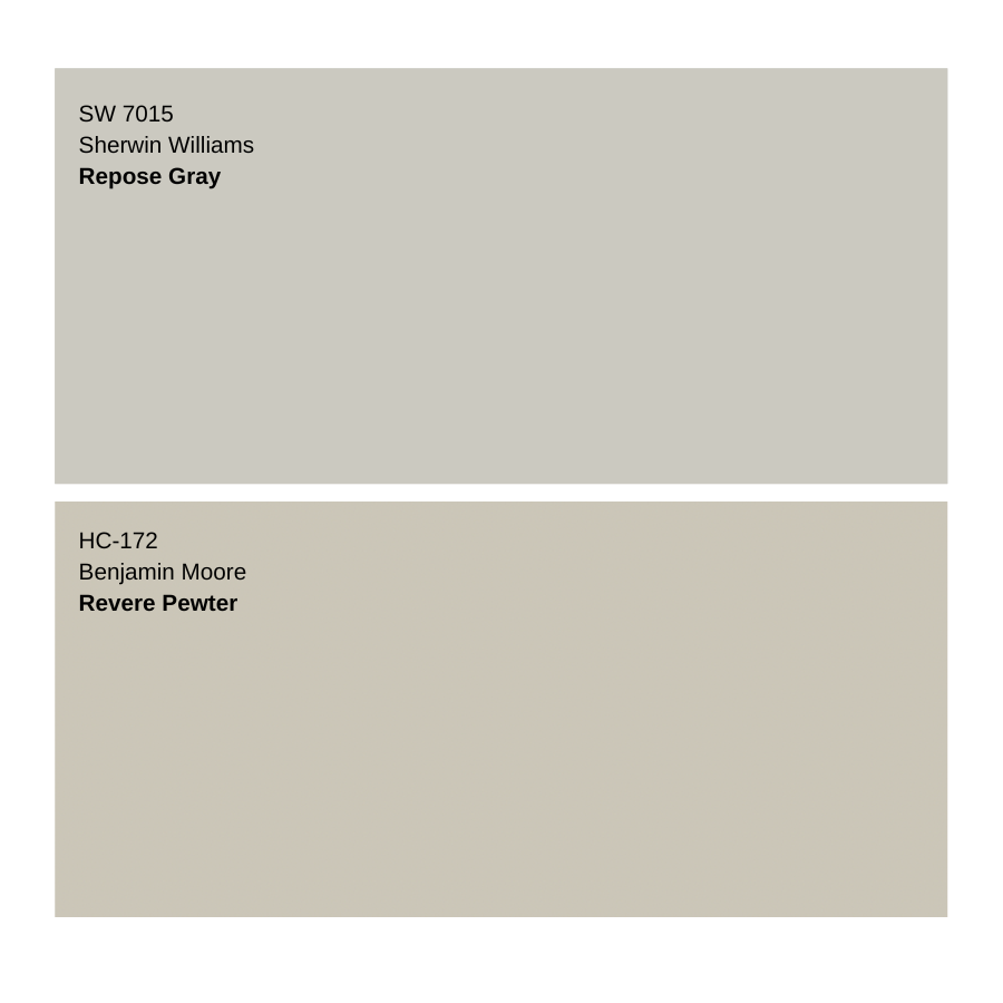
Let’s just hit all the popular grays and throw Benjamin Moore Revere Pewter into the mix. Benjamin Moore describes this color as, “An iconic neutral that provides a versatile bridge between warm and cool tones.” It rose to fame in the 2010s as a popular greige paint color and it’s still a top color. In fact, Instagram boasts nearly 10,000 posts with the hashtag #reverepewter! Comparing LRVs Revere Pewter is slightly lower at 55.05 while Repose Gray is 58 which means that Revere Pewter will appear slightly lighter and will reflect more light. Revere Pewter is a really nice color, just know you’ll no longer be in the gray realm as Revere Pewter is a solid greige paint color.
Final Thoughts on Sherwin Williams Repose Gray
In my opinion, Repose Gray is worth all the hype. All things considered, it’s an ideal gray paint color. Repose Gray is a really nice balanced paint color that really works in most lighting situations. I think it’s a nice option if you want to pick one paint color for your whole house or if you are just looking to freshen up one space. Sherwin Williams Repose Gray will provide the cozy, refined feel that we all want at home!


Hey! love this color in our new home. what color curtains and blinds to choose.
help!